Roguelike HUD Review
Just collecting roguelike UIs to see what kind of information they keep visible to the player and understand some of the decisions around what is chosen for display.
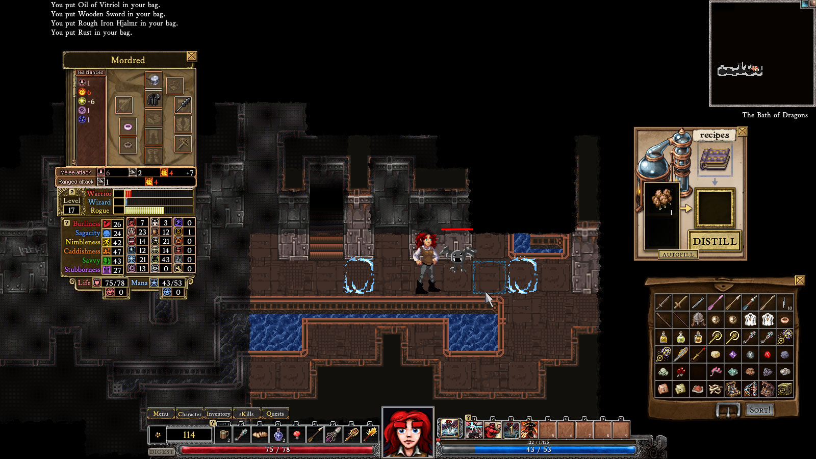
Dungeon Crawl Stone Soup HUD
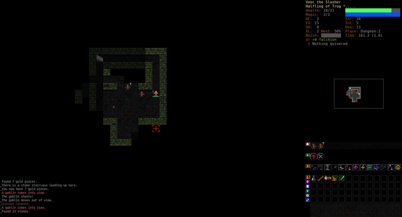
Not much to say. Pretty standard graphics for a roguelike. Not too bad, but feels pretty generic. I see it and I don’t think DCSS. Could be any roguelike.
Some things I dislike:
- stats overload. After health and magic, do we really need to know the rest
- healthbars feel too large (disproportional)
- abbreviations are not beginner friendly
- unclear what the equipped item bonuses mean
- Not shown, but there’s a status line at bottom with stuff like “tele”. Very confusing. Nothing indicates “tele” is a status ailment.
- tile perspective is functional, but not very appealing. lack of perspective makes you feel disconnected from the PC and the action. Environment and characters are different perspective
- player has tiny (and unnecessary) healthbar
- without the healthbar would be hard to pick out the PC.
- all enemies are identically sized. Missed chance to express a relative danger level. The bigger a humanoid the more danger.
- inventory is confusing(what do the icon tabs do?)
- all kinds of confirm messages pop up during mouse UI that require the keyboard to execute
Dungeons of Dredmor HUD
I like the look of this. It has the persepective I want to use and breaks away from the grid look. This screenshot has the inventory open, but the normal UI is stripped down to essential info
The character/BG separation could be better. I didn’t even notice there was an enemy bat at first. The black undiscovered map area is a bit harsh, but not sure how else to deal with it.
Noticing that hte minimap is a pretty constant feature of most RLs. At least the ones with large level maps. Suppose that’s because of the gfx and randomization making most maps pretty unremarkable and pointless/difficult to remember. Kind of dislike having a map in the HUD. Kills the spirit of exploration for me a little. A toggleable overlay may be my preferred compromise.
ADOM HUD
Very pretty. Like Dungeons of Dredmor, the perspective is good and it feels immersive. It looks like tooltips for available actions show up on screen which is a nice touch.
Like DCSS the UI seems overcrowded with stat information that isn’t impactful for normal gameplay. Lots of abbreviations and the icon menu is a bit intimidating. The layout is much better than DCSS . More compact.
Dungeon Dashers
High marks here. Minimal, clutterless GUI. Easy access to skills. This one made me realize something I’d missed about the “useless” clutter like stats; those stats adds a personal touch to your character. The one danger when you add graphics is that you remove space for the player’s own vision of the character to live. Dungeon Dashers doesn’t leave much room for the player. Each character is named, has a bio, and their portraits are defined. I’m not against it here since you don’t customize the characters (I think) so it’s not a fair criticism for DD. As I was reading the wizards bio (dull stuff about him being a prick) I see why many RLs like to have all that stat junk font and center. It personalizes their PC.
I still think it’s bad UI to include all that stuff, but I think including something small (like the player’s name) is worth the clutter because it helps the player’s attachment.
Diablo I HUD
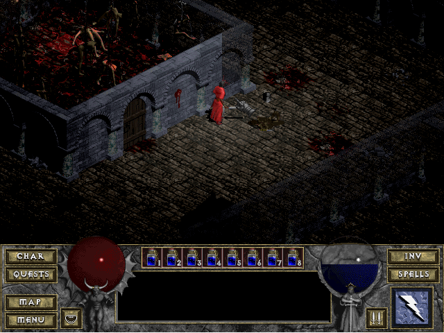
I remember reading that Diablo was inspired by roguelikes in the early stages before becoming its own thing. I was curious if the GUI was as simple as I remembered. I think it holds up pretty well. Focused display of gameplay important stats like health/mana. Readily accessible health items that the game manages. Some buttons to access menus(visually grouped) along with a skill access button.
Worst I could say is that it’s a little large due to a descriptive box that lists details about enemies which they actually remove in the sequel.
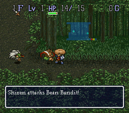
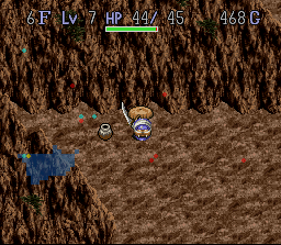
Shiren The Wanderer/ Milandra
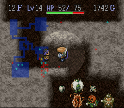
First image is Shiren, the second Milandra. Thought they’d make an interesting case since they were both on the SNES which had a pretty small resolution. Early roguelike resolutions were probably like 320x200 or 40x25 characters. SNES had a 256x224 resolution so more like 16x14 characters.
By necessity, the UI is pretty simple. HP, level, dungeon progress. As a side note, Shiren is really pretty. Just the level of visuals I’m aspiring to, though not the same style. What I like about Shiren is how much it breaks up the tiled look.